The Braves dress up (and controversy)
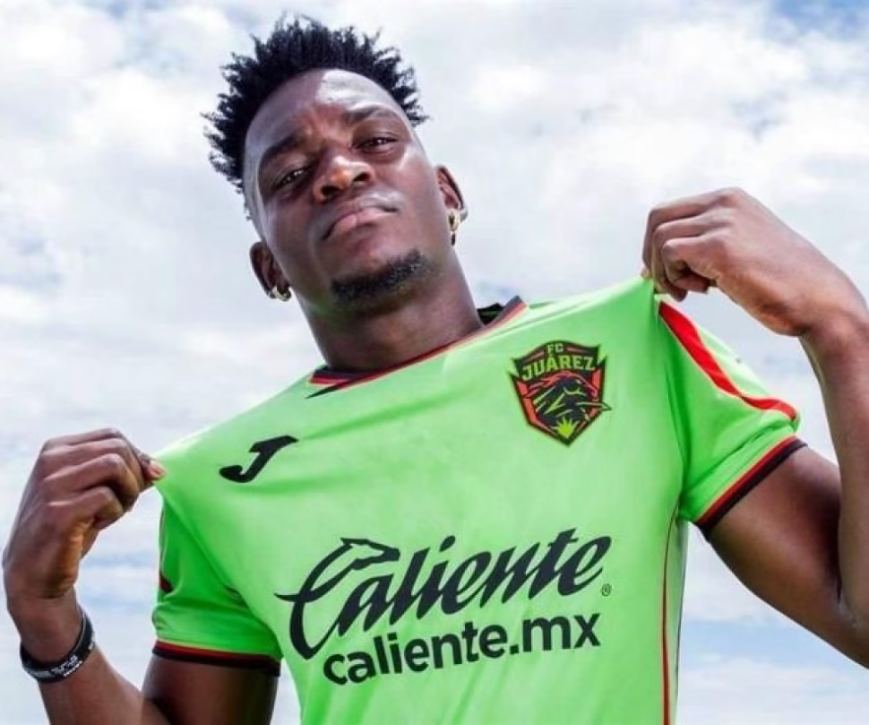
Attention, lovers of football drama and sports fashion! Futbol Club Juárez, in a burst of originality worthy of a reality show, decided to celebrate its tenth anniversary with what we all expected: more advertising in the form of fabric. Yes, the Braves unveiled their new uniforms, because nothing says “happy birthday” like a sponsored wardrobe change.
Goodbye Sporelli, hello Joma: the most talked about divorce
After a relationship with Sporelli that lasted as long as a game in the rain at Azteca, the Juarenses signed for the Spanish firm Joma. Reason? Maybe they wanted something more “European”, or maybe someone on the board lost a bet. The truth is that now players will wear designs that, according to rumors, were inspired by a cross between a traffic light and a geometry book.
The local uniform keeps the green (what a surprise), but with red and black as if someone had spilled paint on the design. The faint “X” in front is the “symbolic” detail: tribute to the anniversary? Reference to the monument to Mexicanness? Or did the designer simply run out of ideas and draw the first thing he saw in his sketchbook? The mystery continues.
And for away games, black is the new (literal) black. With red and green details, it looks like an unauthorized homage to a deck of cards. Elegant, yes, but perhaps too sober for a team that usually gives more pain than glory on the field.
What is undeniable is that, between brand changes and historical nods, the Braves have achieved the impossible: that we talk about something other than their sporting performance. Bravo for that.
Do you like the new design or do you prefer the classic? Share your opinion and tag a friend who always criticizes the uniforms. And if you want more sarcastic analysis of the world of football, explore our content!